Color is everywhere! It fills our world with a sensory richness that goes beyond mere aesthetics. From the orange glow of a setting sun to the deep blues of the ocean, color has a profound influence on our lives. But have you ever wondered how colors work? Why do certain colors look good together while others clash? Welcome to Color Theory 101, where we’ll explore the basics of color theory and how to harness its power in various aspects of life. This blog post aims to help you understand the fundamental concepts without overwhelming you with technical jargon. So, let’s get started!
Color Theory 101: The Color Wheel
Most of us are familiar with the color wheel from our school days, but do you know how it came into existence? Sir Isaac Newton, the same person who discovered gravity, experimented with prisms and spectrums of light. His work was the basis for theories on primary colors and much of his work influenced early color wheels and the color wheel we know today.
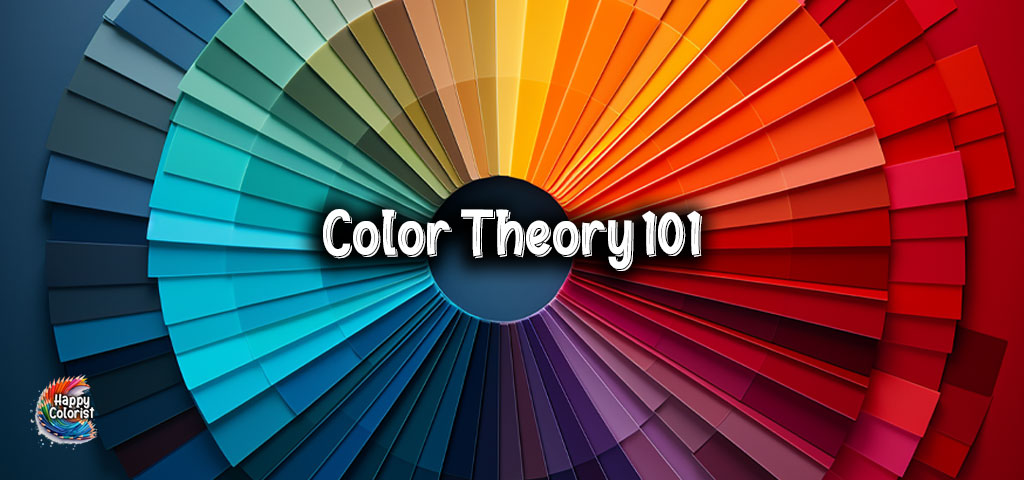
The color wheel serves as a visual representation of the relationship between different hues. It’s made up of primary colors (red, yellow, blue), secondary colors (orange, green, purple), and tertiary colors (mixtures of primary and secondary colors, like red-orange or blue-green).
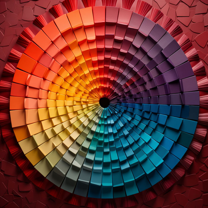
The color wheel is helpful for anyone interested in creating visually appealing designs. You can use the color wheel to figure out which colors go well together. If you’re interested in designing a poster, for example, you can use the wheel as a guide for selecting a color scheme that won’t make viewers cringe. By the end of this section, you should have a solid grasp of what the color wheel is and how to use it in your daily life.
Warm vs. Cool Colors: Setting the Mood
Part of color theory 101 is understanding that colors have the power to elicit specific emotional responses. Ever wondered why restaurants often have warm hues like red and orange? These colors are believed to stimulate appetite and create a cozy atmosphere. On the other hand, blues and greens are cool colors that evoke calmness and serenity. Imagine walking into a spa with red walls; it would be a bit jarring, wouldn’t it?
Warm colors include shades like red, orange, and yellow, while cool colors encompass hues like blue, green, and purple. Understanding the psychological impact of warm and cool colors is vital for anyone interested in design, art, or marketing. For instance, if you’re painting a room in your house, the color you choose can significantly influence the room’s vibe. A bedroom painted in shades of blue may help you relax and sleep better, whereas a kitchen with vibrant red accents can invigorate you while you prepare meals. By being aware of the emotional impact of colors, you can make more informed choices in a variety of scenarios.
Complementary and Analogous Colors: Harmony or Contrast?

When it comes to designing a visually engaging piece, be it a painting or a website, knowing how to use complementary and analogous colors can be a game-changer. Complementary colors are those that sit opposite each other on the color wheel, like red and green or blue and orange. These colors create a notable contrast when placed next to each other, capturing attention and adding drama to a composition.
Analogous colors, on the other hand, are those that sit next to each other on the color wheel. They create a harmonious and pleasing effect when used together, like the varying shades of green in a forest. These colors work well when you want to evoke a sense of calm and unity.
Your coloring can be taken to a new level by using complementary and analogous hues carefully. If you’re working on a coloring page featuring a bustling cityscape, for example, strategic use of complementary colors can inject energy and vibrancy into the scene. If you’re coloring a tranquil garden or a serene beach, opting for analogous colors could enhance the sense of peace and harmony inherent in those settings.
See how the principles of color theory come alive? It’s not just about filling in the lines; it’s about creating a mood and telling a story through color.
Color Theory 101: A Spectrum of Possibilities
So there you have it, color theory 101. Your are finished your first lesson on the foundations of color theory! Understanding how colors interact can have a significant impact on more than just your art; it can influence your mood, your decisions, and even your appetite. In a world so vividly awash with color, isn’t it fascinating to think of the endless possibilities that await you when you comprehend the basics of color theory?
But knowledge is just the first step. The real magic happens when you apply what you’ve learned, and what better way to do that than by immersing yourself in a creative endeavor? As you explore the use of color in your own projects, you’ll find that theory comes to life in the most unexpected and delightful ways.
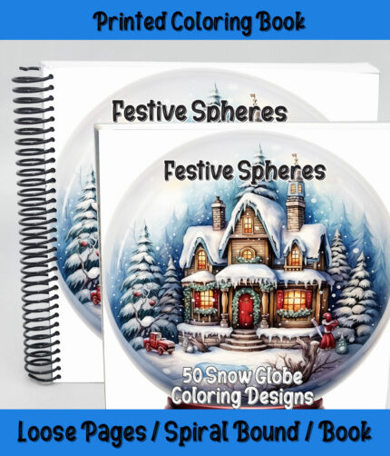
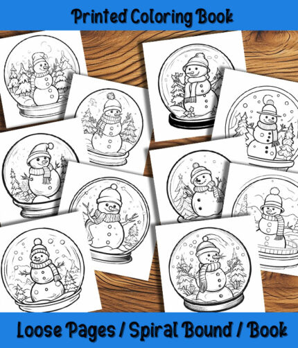
If you’ve enjoyed this voyage into the world of color, why not put that newfound knowledge into practice? Our range of coloring books and pages provides the perfect canvas for you to experiment with hues, shades, and tints. Capture the mood with warm and cool colors, strike a balance with complementary and analogous shades, or break the rules and find your unique expression! We can’t wait to see the masterpieces you’ll create! Happy Coloring!

